The Objective:
Create upgraded Ripo International website design and mobile device app. Users are private person or other company users, with or without advanced experience using the site. Adapt design to existing style identity guidelines.
The Client:
The high quality, design and diversity of the products offered by RIPO make up the brand. A wide assortment of products is suitable for anyone who wants to arrange their home by means of excellent design and quality solutions. RIPO offers both sophisticated, elegant furniture and a wide range of interior elements, as well as building materials and decorative finishes.
The Solution:
There are two versions of the website, where one in light color - rational and logical, the other in dark color more - artistic and inspiring, in addition, one layout for the mobile device. Wireframes, design and prototype were created.
Dark theme
As far as RIPO international positions a manufacturer of high quality goods, I wanted to show the product only from best side and create a story about product and company.
Full layout pictures of the website creates a very modern, thoughtful and functional design who responds to the company's products. Large font size contrasts to draw the user's attention to certain product details. This option was based on a dark theme, as it is currently very popular in web design, as well as fits well with Premium products
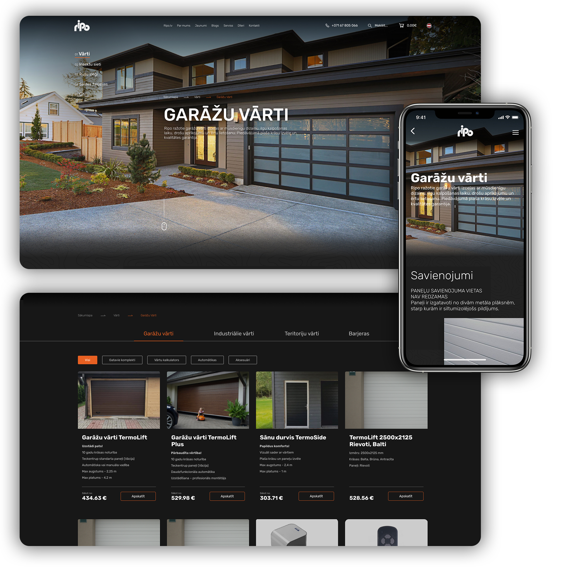
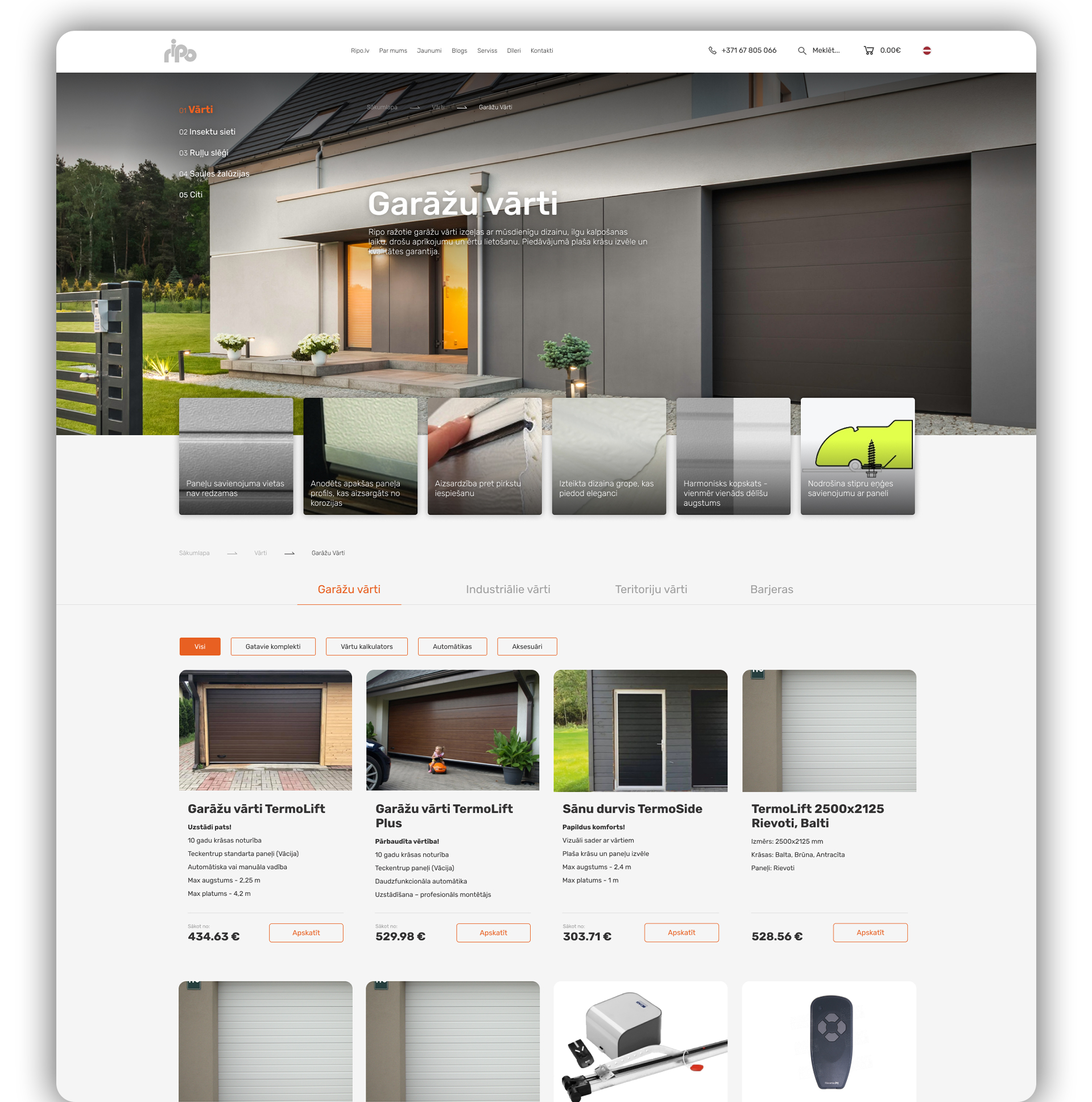
Light theme
The light version, attempt was made to stay close to the existing version with updated graphics. Remove "heavy header” and focus on products. Was decided to leave left-hand navigation, as it took up a lot of space but has bad functionality. Now the navigation is arranged horizontally with the filters below.Product cards were made lighter and easier to understand to eye, frames or other unnecessary objects.